Landing Page Design for Math Textbook
I’ve recently worked on the redesign of a one-page website for a math book, that belongs to a textbook series of a new category of educational products. It has all the content of the mainstream textbooks, but is much more affordable and easy to read. My role: UX/UI and illustration. To be launched soon.
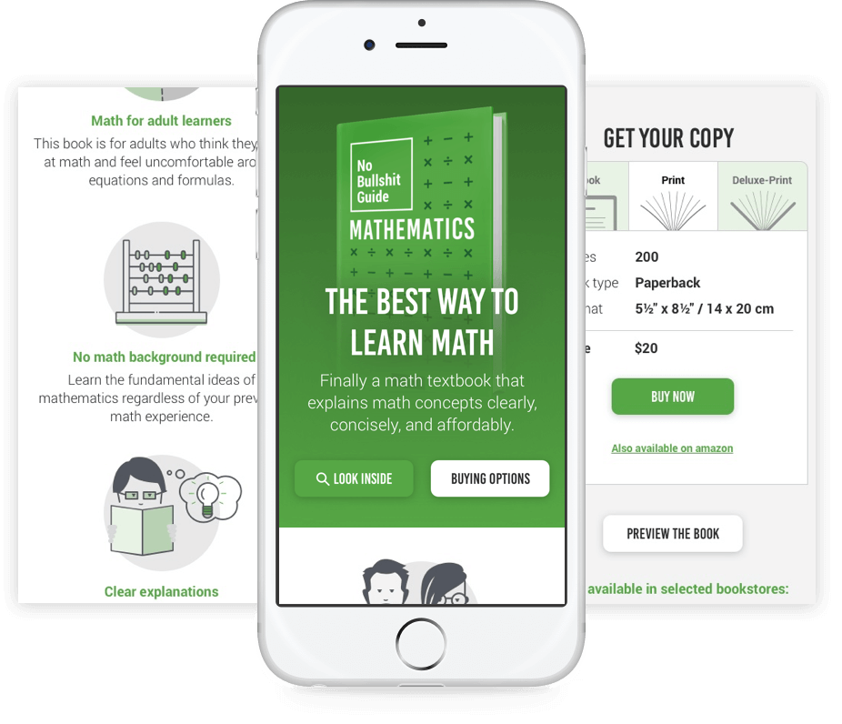
The website is divided into several parts. The top section communicates the USP of the textbook. The second illustrates how this book is different from traditional textbooks. The "Buying Options" CTA will float fixed to the top right corner and will serve as an anchor link to the selling section. The “BUY NOW” button links to lulu.com, an on-demand print service.
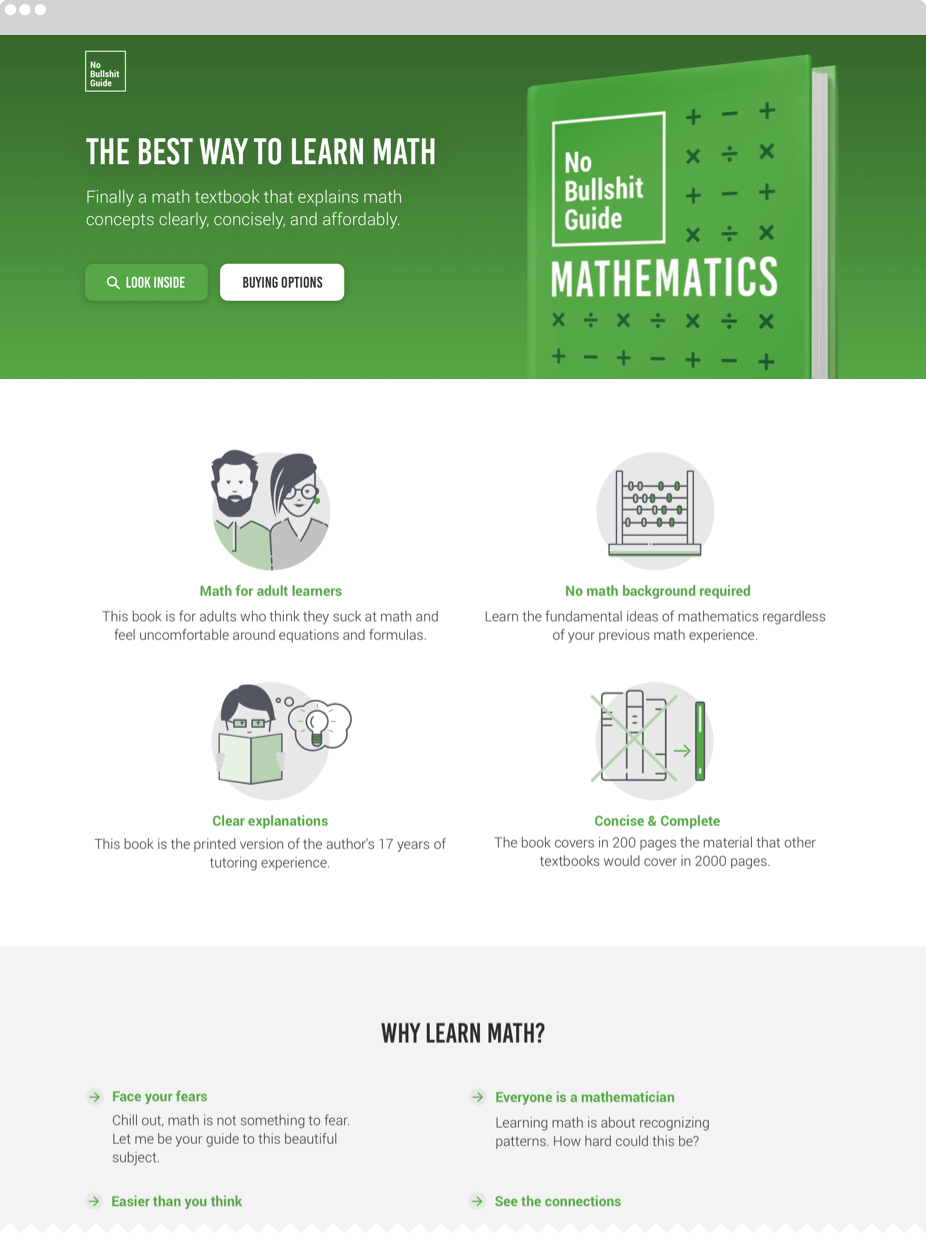
Just alike the mobile version, the top part of the desktop provides the value proposition together with a book shot.
The illustrations and details show for what kind of audience the book is written and that it contains all the content that traditional textbooks cover in 10 x the amount of paper.
The "Buying Options" button will always be visible, sticking to the top as soon as you scroll past the hero section. The user can jump to the buying section if he's already convinced to purchase the textbook.
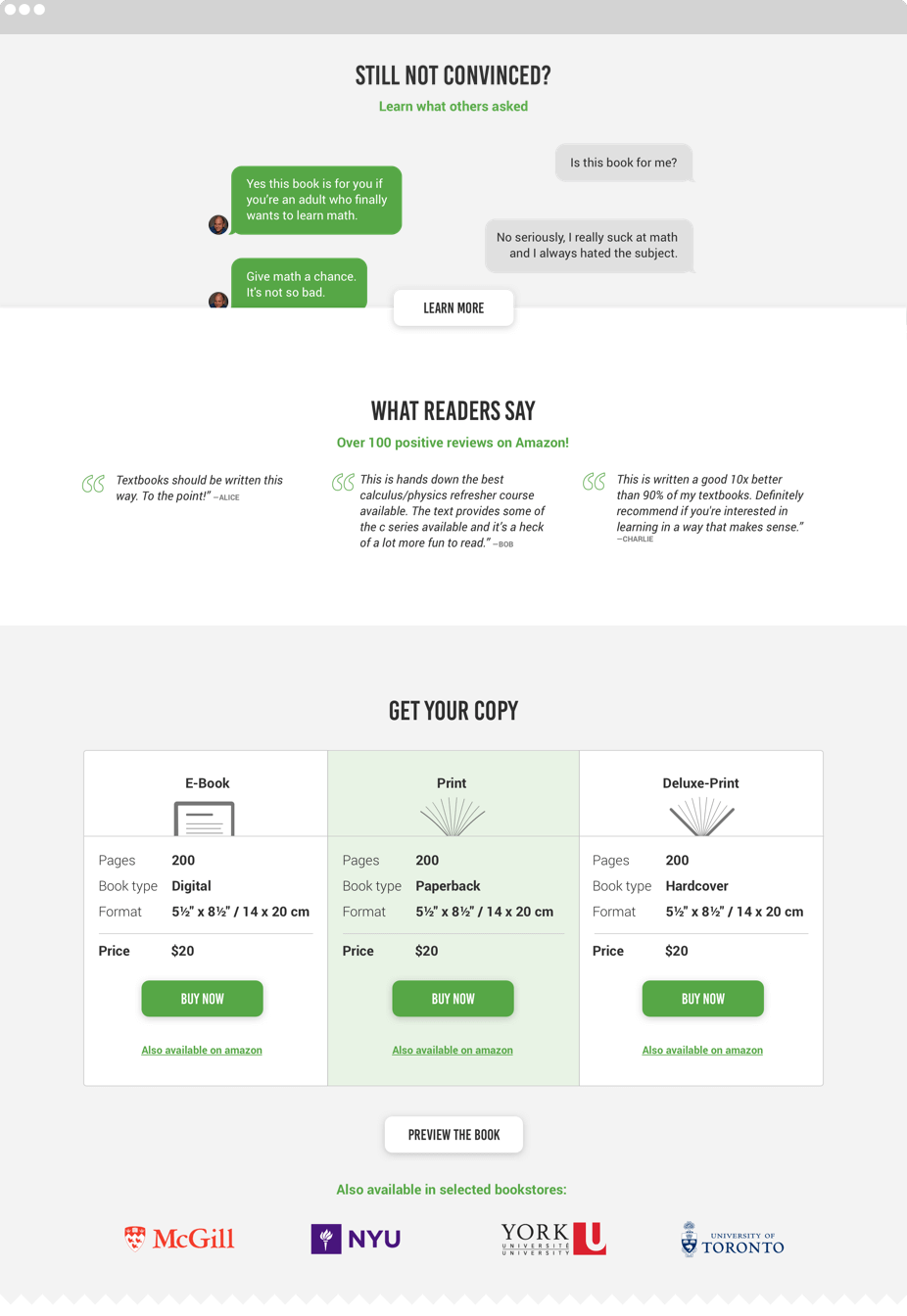
In the middle section of the one-pager you find an animated chat with the author. You get some frequently asked questions and answers about math-related concerns. A click on the "Learn More" button will lead you to additional answers and a contact form.
Some actual reviews from amazon also help to convince the potential customer.
In the buying section you can choose between an ebook, a soft cover and a hard cover. You can also purchase the book in one of the university book stores that are listed below.